
Transforms are specified using the transform and transform-origin CSS properties.
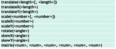
The transform CSS property specifies a set of transform functions: skew(), scale(), rotate() and translate(). There is also matrix, which is usually computer generated and combines all transforms into one.
The transform-origin CSS property defines the origin of the transformation. The default is the center of an element.
Syntax:
- transform: none | <transform-list>
Examples:
- transform: none;
- transform: translate(12px, 50%);
- transform: rotateY(90deg);
- transform: skewX(30deg);
- transform: scale(2, 2);
On the right the functions list is shown.
The following sections describe each transform. In all examples transition is used to make smooth transform.
Translate
Moves an element from its current position. right/bottom for positive numbers and left/up for negative.
2D translation shifts the contents of an element by a horizontal or vertical offset without changing the top or left properties. The element’s position in the page layout is not changed, but the content is shifted and a shifted coordinate system applies to all descendants of the translated element. An element using transform will not cause other elements to flow around it.
Syntax:
transform: translate(-400px);
.translate:hover {
    transform: translate(-400px);
}
transfrom: translate ( <length-x> [, <length-y>] );
transfrom: translateX ( <length> );
transfrom: translateY ( <length> );
[length-x, length-y], where length-x is the translation along the x-axis, and length-y is the translation along the y-axis. If length-y is not provided, it is considered zero and the element is translated along the x-axis only.
In addition to translate() there are translateX() and translateY() functions.
Examples:
- transform: translate(12px, 50%); /* both x and y */
- transform: translate(12px); /* x axis only */
- transform: translateX(2em); /* x axis only */
- transform: translateY(3in); /* y axis only */
Scale
Increases or decreases the size of an element.
The element’s top, left, height, and width properties are unchanged, so the layout of the page is not affected. Consequently, scaling an element up can cause it to cover other elements on the page unless you design the layout to allow room for the expansion.
Scaling also applies to the font-size, padding, height, and width of an element.
Syntax:
transform: scale(2, 5);
.scale:hover {
    transform: scale(2, 5);
}
transfrom: scale ( <number-x> [, <number-y>] );
transfrom: scaleX ( <number> );
transfrom: scaleY ( <number> );
If only one value number-x is provided in the scale() function, the second one number-y is assumed to be equal to the first one.
Examples:
- transform: scale(2, 0.5); /* both x and y */
- transform: scale(2); /* both x and y the same scale */
- transform: scaleX(2); /* x only */
- transform: scaleY(0.5); /* y only */
Skew
skew() function defines a two-dimensional transformation of simultaneous skew transformations of the X and Y axes. Not recommended! Use a combination of skewX(angle), skewY(angle) and/or rotate(angle) instead.
Syntax:
transform: skewX(-20deg);
.skew:hover {
    transform: skewX(-20deg);
}
transfrom: skew ( <angle-x> , <angle-y> );
transfrom: skewX ( <angle> );
transfrom: skewY ( <angle> );
If the angle value is positive, the upper left and bottom right corners of the rectangle are “pulled”. If the value is negative, the upper right and bottom left angles are pulled. An angle value of 90deg (or -90deg) will make the element disappear. A value of 180deg (or -180deg) will leave it unchanged.
Examples:
- transform: skew(42deg, -12deg);
- transform: skewX(-30deg);
- transform: skewY(1.07rad);
Rotate
Rotates an element clockwise (positive angle) or counter-clockwise (negative angle) around its origin by the specified angle. The rotation center point is specified by the transform-origin property.
By default, 2D rotation spins an object around its center point. To rotate an element around a different point, see Changing the Origin.
transform: rotate(360deg);
.rotate:hover {
    transform: rotate(360deg);
}
Syntax:
transfrom: rotate ( <angle> );
transfrom: rotateX ( <angle> );
transfrom: rotateY ( <angle> );
A positive angle value in rotate will rotate the element in the clockwise direction. A negative value will rotate it in the counter-clockwise direction. If rotateX or rotateY are used, there is no difference between positive and negative values. Only in 3D with perspective you will see the difference.
Examples:
- transform: rotate(90deg);
- transform: rotateX(-25deg);
- transform: rotate(1.5rad);
Multiple Transforms
Different transforms, such as rotation and scaling, are applied by setting different values to a single property: transform. There are two different ways to perform multiple transforms on an element—both scaling and rotating an element, for example:
- Use inheritance to apply multiple transforms.
<div style="transform:translate(-10px,-20px)"> <div style="transform:scale(2)"> <div style="transform:rotate(45deg)"> </div> </div> </div> - Set the transform property of the element to a space-delimited list of transform functions, such as:
<div style="transform:
    translate(-10px,-20px) scale(2) rotate(45deg);"
</div>
If you rotate or skew the element using the transform property, you transform and/or skew its entire coordinate system along with it, and all consequent transformations will be applied based on the new coordinate system’s transformation. This is why the order of transformations is very important — different orders will result in different transformations.
Transform Origin
transform: rotate(-45deg) scale(1.3);
transform-origin: 0% 0%;
.origin:hover {
    transform: rotate(-45deg) scale(1.3);
    transform-origin: 0% 0%;
}
By default, the origin for transforms is the center of an element’s bounding box. Elements rotate around their center by default, and scale up or down from the center out.
The transform-origin property allows to place this origin point elsewhere, even outside the element, changing how transforms respond, especially in animations. It accepts x/y measurements (one or two parameters). The transform-origin property can take up to two space-separated keyword or length values for a 2D transform and up to three values for a 3D transform.
To change the origin for transforms of a given element, set the transform-origin property. The new origin is specified as a distance or percentage from the element’s upper-left corner.
Values can be lengths, percentages or the keywords top, left, right, bottom, and center. The syntax is the same as background-position. The keywords are:
- left - 0%
- center - 50%
- right - 100%
- top - 0%
- bottom - 100%
Examples:
- transform-origin: 50% 50%; /* this is the default center */
- transform-origin: 0px 0px; /* upper-left corner */
- transform-origin: bottom; /* bottom center */