CSS3
Transforms
Learn & Practice
Learn & Practice
Transform offers changing and repositioning of an element.
CSS Transform offers the possibility to scale, rotate, reposition and skew an element through CSS.
There are two categories of transform - 2D transforms and 3D transforms.
Two-dimensional transformations let you move (translate), scale, rotate, and/or skew an element on your page along the X (left and right) and Y (up and down) axes.
A transform can be specified using the transform CSS property. It supports a list of functions. You can chain together functions to apply multiple transforms at once to an object. The supported functions are:
You can define a static transform on an element (like a text on the right). The transform is defined in the element CSS declarations.
You can also apply a transform on a state change (for example on hover state). In this case when the state changes, transform will be applied (like the box on the right). Transition can be added to make the change smooth.
Important: for animation purposes, unless you have a specific need, do not set the margin, padding, top, left, bottom, or right CSS properties. Use transform (for example translate) instead, which gives better performance.
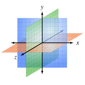
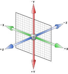
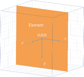
CSS 3D Transform extends CSS Transform to allow elements to be transformed in three-dimensional space.
The standard HTML coordinate system has two axes: the x-axis increases horizontally to the right, and the y-axis increases vertically downwards. With 3D transforms, a z-axis is added, with positive values rising out of the window toward the user and negative values falling away from the user.
A transformed object may be transformed along the z- x- or/and y-axis.