3D Transform Functions

Like 2D transforms, 3D transforms are set using the transform property. You can apply a transform to an element by specifying a transform function, a list of transform functions, or by passing in a 3D matrix. There are several functions that perform 3D transforms. There are also special 3D transform CSS properties.
3D Transform Functions:
- translateZ(distance) — moves an element closer or farther away.
- translate3d(x, y, z) — moves an element in three dimensions.
- rotateZ(degrees) — rotates an element around the z-axis.
- rotate3d(x, y, z, degrees) - shorthand for 3D rotation
- perspective(distance) — sets the 3D perspective for a single element.
3D Transform Properties:
- transform
- transform-origin
- perspective — specifies the perspective on how 3D elements are viewed.
- perspective-origin — specifies the bottom position of 3D elements.
- transform-style — specifies how nested elements are rendered in 3D space.
- backface-visibility — defines whether or not an element should be visible when not facing the screen.
Important: You must set a perspective for 3D transforms to have a visible 3D effect.
The following sections describe:
- Adding 3D Perspective and Perspective Origin setting
- 3D Translate
- 3D Rotate
- 3D Scale
- Transform Style
Adding 3D Perspective
Perspecive is a distance between the object and the viewer. Set the perspective by use of perspective CSS property.
The perspective is specified in distance from the screen. You may specify the distance in pixels, or any CSS distance unit. If no unit type is supplied, px is assumed.
smaller # = closer; larger # = farther
perspective: 200px
I am text inside the box with perspective.
My properties on hover are:
transform: rotateX(45deg);
transform-origin: 50% 80%;
Note: Perspective settings of 300px or less tend to create intense perspective distortion; settings from 500px to 1000px create moderate perspective distortion, and settings of more than 2000px give very mild perspective distortion.
Important: You need to create a container that sets the perspective property, enclosing all the elements that you want to have the appearance of depth. You can set the perspective on the body element if you like.
Perspective Origin
We can set a perspective vanishing point (viewpoint) by using perspective-origin CSS property.
The default setting is perspective-origin: 50% 50%. To set the viewpoint above the top-left corner of an element, for example, set the element’s style to perspective-origin: 0px 0px.
In the following, perspective is set to 200px.
perspective: 200px;
perspective-origin: 100% 0%;
I am text inside the box with perspective.
My properties on hover are:
transform: rotate(45deg);
transform-origin: 50% 80%;
3D Translate
In addition to 2D translate functions, there are translateZ and translate3d functions.
translateZ() function is similar to 2D functions and is used to translate an element by the given amount along the z-axis.
Syntax:
transfrom: translateZ ( <length> );
translate3d() function is the three-dimensional equivalent of the translate() function. It is used to translate the element by a vector [tx, ty, tz], where tx is the translation along the x-axis, ty is the translation along the y-axis, and tz is the translation along the z-axis. The values tx, ty, and tz are provided either as a <length> or as a percentage.
Syntax:
transform: translate3d( <number> , <number> , <number> );
The three parameters specify the translation direction, and together they form a direction vector [x, y, z] which is used to apply the translation in the specified direction.
Examples:
In the following, perspective is set to 200px.
translateX(-40px);
translateY(40px);
translateZ(70px);
3D Rotate
In addition to rotateX and rotateY functions, there are rotateZ and rotate3d functions.
rotateZ() function is similar to 2D functions and is used to rotate around the z-axis.
Syntax:
transfrom: rotateZ ( <angle> );
rotate3d() function rotates an element around its origin (as specified by the transform-origin property) by the specified angle in x/y/z plane.
By default, 3D rotation spins an object around its center point. To rotate an element around a different point, change transform-origin property.
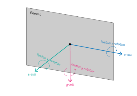
In the figure on the right you can see the positive rotation direction for each axis. Pay attention to the positive for y-axis.
Syntax:
transform: rotate3d(<number> , <number> , <number> , <angle>);
The first three parameters specify the rotation direction, and together they form a direction vector [x, y, z] which is used to apply the rotation in the specified direction. The last parameter is the rotation angle.
For example, rotateX(<angle>) is equivalent to rotate3d(1, 0, 0, <angle>);
Examples:
In the following, perspective is set to 200px.
rotateX(45deg);
rotateY(45deg);
rotateZ(45deg);
rotate3d(1, -1, 0, 60deg);
3D Scale
In addition to 2D scale functions, there are scaleZ and scale3d functions.
scaleZ() function is similar to 2D functions and is used to scale an element in the third dimension, along the z-axis.
Syntax:
transfrom: scaleZ ( <number> );
scale3d() function modifies the size of an element. Because the amount of scaling is defined by a vector, it can resize different dimensions at different scales.
Important: just scaling Z without translation/rotation has no effect. This is since scaleZ() scales the element along the z-axis. Thus, if Z translation is done, we will see the scaling. The order is important here: first scale Z and then translate Z. Practically, it’s kind of like the z-axis itself is scaled, and then the position of the element on the z-axis will automatically be affected by the scale operation on the axis.
Syntax:
transform: scale3d( <number> , <number> , <number> );
It takes three unitless <number>s as a value: sx, sy, and sz, where sx will scale the element in the direction of the x-asix, sy will scale it in the direction of the y-axis, and sz will scale it in the direction of the z-axis.
Examples:
In the following, perspective is set to 200px.
scaleX(2);
scaleY(2);
scaleZ(2);
scale3d(2,2,2);
translateZ(40px);
scaleZ(2) translateZ(40px);
scale3d(2,2,2) translate(40px);
Transform Style
transform-style CSS property accepts one of two values: flat (the default) and preserve-3d. If a parent has preserve-3d transform style, then its direct children follow perspective as defined in the parent of its parent.
Example of flat and preserve-3d are shown below. The HTML and CSS of both examples are:
HTML:                                         CSS:
<div class="container">                       .container { perspective: 300px; }
    <div class="parent">                      .container:hover .parent { transform: translateZ(50px) rotateY(180deg); }
        <div class="child-1"></div>           .container:hover .child-1 { transform: translateZ(100px) rotateY(45deg); }
        <div class="child-2"></div>           .container:hover .child-2 { transform: translateZ(200px) rotateY(15deg); }
    </div>
</div>
The difference:
Left example:                                 Right example - is defined as <div class="parent flat">:
.parent { transform-style: preserve-3d; }              .parent.flat { transform-style: flat; }