SVG uses styling properties to define how the graphics elements in the SVG content are to be rendered.
Styling properties can be assigned either using:
- using SVG’s presentation attributes - the basic way of styling in SVG.
- using CSS to add style information to SVG elements. CSS rules can be written in SVG document as external CSS style sheet, internal CSS style sheet or inline style.
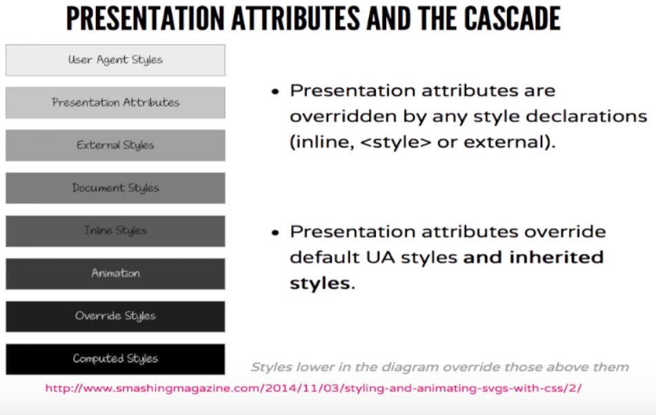
Presentation Attributes
SVG has presentation attributes, which are a shorthand for setting a CSS property on an element.
For example stroke, fill, stroke-width, ... are all presentation attributes.
Most SVG presentational attributes have identical CSS properties. Some of these attributes are the same as regular CSS properties, such as opacity and transform, while some are not, such as fill, stroke and stroke-width.
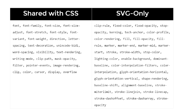
See Full List of shared attributes with CSS.
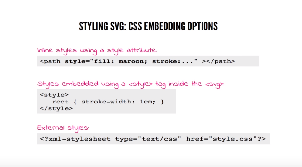
CSS Style
Another way to set the styles of an SVG element is to use CSS properties. The properties can be defined inside SVG (embedded) or by regular html styling outside the SVG.
Embedded SVG styles can be added in 3 different ways:
Example:
<svg style="width: 300px; height: 300px;" viewBox="0 0 600 600">
<polygon
  style="fill: #FF931E; stroke: #ED1C24; stroke-width: 5;"
  points="279.1,160.8 195.2,193.3 174.4,280.8
        117.6,211.1 27.9,218.3 76.7,142.7 42.1,
        59.6 129.1,82.7 197.4,24.1 202.3,114 "/>
</svg>
Style can be defined also as we do it normally (in the 'head' HTML section or externally).
Example: Hover the circle.
HTML:
<svg width="300" height="300">
    <circle cx="150" cy="150" r="50" />
</svg>

CSS:
circle {
    fill: green;
    transition: fill 1s ease-out;
}
circle:hover {
    fill: red;
}
Classes and IDs
Classes and IDs can be applied too. All the CSS selectors rules can be applied.
HTML:
<svg width="150" height="150">
    <rect class="myRect" x="10" y="10" width="100" height="70" />
</svg>

CSS:
rect.myRect {
    stroke: black;
    stroke-width: 7;
    animation: rect-anim 3s linear alternate infinite;
}

@keyframes rect-anim {
    from {
        fill: green;
    }
    to {
        fill: red;
    }
}