CSS3
Transitions
Learn & Practice
Learn & Practice
Getting things to move is ease
BUT
Planning HOW they should move is hard
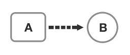
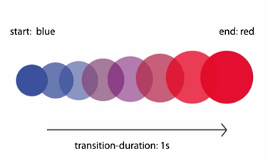
Transition is the simplest kind of animation. Transitions describe how to execute a CSS property animation from one state to another state over time. On the right diagram, some of the square properties may be animated to obtain a circle in a time period.
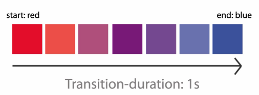
Example: in the figure below you can see the animation process stages from the blue small circle to the final red big circle over 1 second period.
By use of transitions we can alter the appearance of an element whenever a state change occurs, such as when it is hovered over, focused on, active, or other state change.
Live Example: on the right, letter-spacing of the div element is changed and also the opacity is changed from 1 to 0. The change starts on div hover, and it is animated over 1 seconds period.
Note: CSS has hardware acceleration for smooth transitions, while jQuery animation often has performance issues.
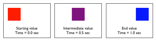
It is important to note, that not all properties may be transitioned. Only properties that have an identifiable halfway point may be animated. For example, colors, font sizes, and the alike may be transitioned from one value to another as they have recognizable values in-between one another (intermediate values). The display property, for example, may not be transitioned as it does not have any midpoint.
In the following example you can play with various transitions.
Some of the more popular transitional properties include the following (for more properties see Animatable CSS properties):
Recommended for performance are: transform (scale, rotate, translate), opacity (use with pointer-event: none instead of display). For more details see High Performance Animations and CSS Triggers in which good properties for animation are those that require Composite stage only.
For cool examples
with animated properties
see Animatable site and also Animista site to play.