The transition-timing-function CSS property defines how a transition will proceed over its duration, allowing a transition to change speed during its course.
Each function is specified on this page. To see how it works just touch the blue boxes. Every box has a specified by the section transition on 4 seconds interval.
See also Easing Functions Cheat Sheet, Ceaser CSS EASING ANIMATION TOOL and cubic-bezier generator.
Linear

Using linear timing function, the animation goes from its initial state to its final one regularly, with a constant speed.
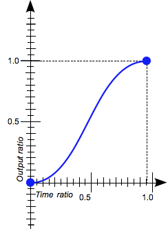
Ease
Ease function is similar to ease-in-out, though it accelerates more sharply at the beginning and the acceleration already starts to slow down near the middle of it. This is a default if not timing function is specifies.
Ease-in
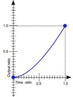
In ease-in the animation begins slowly, then progressively accelerates until the final state is reached and the animation stops abruptly.
Ease-out
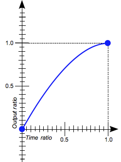
In ease-out the animation starts quickly then slow progressively down when approaching to its final state.
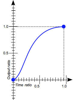
Ease-in-out
With ease-in-out timing function, the animation starts slowly, accelerates then slows down when approaching its final state. At the beginning, it behaves similarly to the ease-in function; at the end, it is similar to the ease-out function.
Steps()
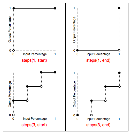
The steps() function allows to specify intervals for the timing function. It takes one or two parameters, separated by a comma: a positive integer and an optional value of either start or end. If no second parameter is included, it will default to end.
Syntax:
steps(number_of_steps, direction)
step-start
step-end
When start is specified, the change of values occurs at the start of each interval, while end causes the change of values to occur at the end of each interval.
Hover the circle. The white line will rotate 360 degree during 1 minute (we will learn how to rotate in transform lesson). The transition from 0 to 360 degree is defined by:
transition: 60s steps(60, end);
Thus, the first change will be seen 1 seconds after hover the circle. If it was start, the change will be seen immediately on hover.
cubic-bezier()
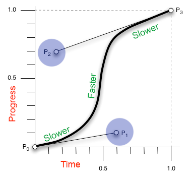
Specifies a cubic-bezier curve.
Back in the 1960s, engineer Pierre Bézier used special curves in order to specify how he wanted car parts to look like. These curves are called Bézier curves. See interesting Article on Bezier Curves .
The timing function is specified using a cubic bezier curve, which is defined by four control points, P0 through P3 (see diagram below). P0 and P3 are always set to (0,0) and (1,1). The ‘transition-timing-function’ property is used to specify the values for points P1 and P2. These can be set to preset values using the keywords listed (see above), or can be set to specific values using the ‘cubic-bezier’ function. In the ‘cubic-bezier’ function, P1 and P2 are each specified by both an X and Y value.
See Cubic-Bezier generator.