Introduction
The modern browsers support CSS styles applied to SVG to make graphical effects. For example blending, transforms. There are new features as clip and mask, which are currently partially supported by the browsers.
Example of using CSS blending on SVG elements:
Inline SVG can be blended by using internal SVG blending functions or by CSS mix-blend-mode.
In the following example the circles on the left are blended by the multiply CSS mix-blend-mode mode and on the right by the screen CSS mix-blend-mode mode.
The code for the left example is:
HTML:
<svg class="blend multiply" viewbox="0 0 8 8">
    <circle fill="cyan" cx="4" cy="3" r="2" />
    <circle fill="yellow" cx="3" cy="5" r="2" />
    <circle fill="magenta" cx="5" cy="5" r="2" />
</svg>

CSS:
.blend {
    width: 10em;
    height: 10em;
}
.multiply {
    background: white;
}
.multiply circle {
    mix-blend-mode: multiply;
}
The second example uses black background and screen blending mode.
SVG provides its own features for graphical effects. There is a posibility to apply SVG effects to HTML regular content (partially supported and not covered here).
SVG features for graphical effects include:
- Gradient Fill - filling SVG element with a gradient.
- Clip Path - clipping SVG element with some closed path. Any path, text or closed drawing element can serve as a clipping path.
- Pattern Fill - filling SVG element with a pattern.
- Mask - mask SVG element with some texture.
- Transform - similar to CSS. SVG supports translate, scale, skew, rotate, matrix. We can use CSS transform on SVG elements instead of built-in SVG transform.
- Filter - Filters are complicated and not covered here.
We may use gradients, clip, mask and patterns for example to make textured text. For more details see CSS vs. SVG: Graphical Text Effects. See also text effects examples in SVG Text Effects Gallery and SVG Text Effects .
SVG Gradients
For more details see SVG Gradients.
SVG gradients are a way of filling shapes with color. Any SVG shape with 'fill' attribute may be filled (including path and text). This a way to apply gradient to text (there is no currently such an option in CSS).
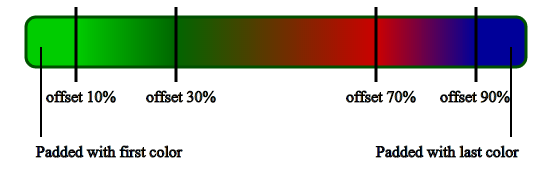
SVG supports linear and radial gradient. if the gradient does not fill out the shape completely (x2, y2 gradient direction attributes are not 100%), the space outside the gradient may be filled with one of the three options: pad (the default), repeat and reflect (mirroring).
All gradient definitions are written inside the <defs> section. Its ID is used inside the 'fill' or 'stroke' attribute value. A few gradients may be defined inside the 'defs'. The code of the 'Pad' above is shown below (there are additional ways to define a gradient):
<svg width="100%" height="220" style="border: 1px solid red;">
    <defs>
        <linearGradient id="gr-pad" x1="0%" y1="0%" x2="20%" y2="0%" spreadMethod="pad">
            <stop offset="5%" stop-color="red" />
            <stop offset="95%" stop-color="blue" />
        </linearGradient>
    </defs>
    <rect x="10" y="10" rx="15" ry="15" width="150" height="150" fill="url(#gr-pad)" />
    <text x="15" y="30" fill="white" font-family="sans-serif" font-size="12pt">Pad</text>
</svg>
x1, y2, x2, y2 define the direction of the linear vector.
Color stop is similar to the one in CSS. There are offset, stop-color, and stop-opacity attributes.
See more examples in Gradient Fill demo.
Clip-Path
For more details see Clipping in CSS and SVG.
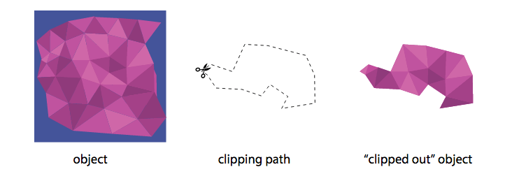
Both CSS and SVG allow us to clip elements into custom non-rectangular shapes. In CSS it is partially supported.
Clipping is a graphical operation that allows to fully or partially hide portions of an element. The clipped element can be any container or graphics element. Clipping path defines the region of the element that will be shown. Any SVG shape can be used as a clip path. Note that clip path can only reference the simple SVG shapes and cannot be used to reference groups. However more than one shapes can be used inside the clip path.
CSS property 'clip-path' can get the SVG clipPath (by clipPath ID) or shape to clip an element (partually supported). See example in CSS Shapes, clipping and masking – and how to use them. You can use CSS clip-path marker tool. You can try animating some CSS clip-paths.
In SVG, we use <clippath> element with id to define a clipping path. The 'clip-path' presentation attribute has to be used on the shape to be clipped.
<svg>
    <defs>
        <clipPath id="my-clip-path">
            <!-- put here one or more elements which will serve as clip path -->
            ...
        </clipPath>
    </defs>
    <!-- the element you want to apply the clipPath to can be any SVG element -->
    <g id="my-graphic" clip-path="url(#my-clip-path)">
            ...
    </g>
</svg>
Example:
<svg width="100%" height="200" style="border: 1px solid red">
    <defs>
        <clipPath id="my-clip-path">
            <text x="50" y="90%" font-size="200">Text</text>
        </clipPath>
        </defs>
        <g id="my-graphic" clip-path="url(#my-clip-path)">
            <image x="0" y="0" xlink:href="images/view.jpg" width="400" height="300" />
        </g>
</svg>
See more examples in Clip Path demo.
Pattern Fill
For more details see How to Use SVG Patterns.
Like gradients, the 'pattern' element should be put in the 'defs' section of your SVG file. Inside the pattern element you can include any of the other basic shapes, and each of them can be styled using any of the styles as regular shapes, including gradients and opacity.
Example:
Instead of using a background image and clipping it to the shape or text, we can apply a background or pattern to shape/text is by filling it with a pattern.
<svg width="100%" height="150" style="border: 1px solid red;">
    <defs>
        <pattern id="filler" patternUnits="userSpaceOnUse" width="400" height="400">
            <image xlink:href="images/wood.png" width="400" height="400" />
        </pattern>
    </defs>
    <text x="0" y="90%" font-size="200" font-weight="bold" fill="url(#filler)">SVG</text>>
</svg>
Example:
<svg width="600" height="300" style="border: 1px solid red;">
    <defs>
        <pattern id="textPattern" x="7" y="7" width="10" height="10" patternUnits="userSpaceOnUse">
            <circle cx="5" cy="5" r="5" fill= "navy" />
        </pattern>
    </defs>
    <text x="0" y="50%" font-size="250" fill="url(#textPattern)">Text</text>
</svg>
Mask
Masks are images; Clips are always vector paths. Outside the path is transparent, inside the path is opaque.
clippath simply cuts the object to its path boundaries. It’s like a scissor cut. mask takes transparency and brightness of the mask into account which allows for a kind of filtering of the object.
A 'mask' can contain any graphical elements or container elements such as a 'g'. Any graphical object which uses/references the given 'mask' element will be painted onto the background through the mask, thus completely or partially masking out parts of the graphical object.
Imagine a square image that is a left-to-right, black-to-white gradient. That can be a mask. The element it is applied to will be transparent (see-through) where there is black in our gradient mask image, and opaque (normal) where there is white. So the final result will be an element that fades in from left to right.
Thus, when using mask, the element will—by default—be drawn where the mask is white, and it will not be drawn where the mask is black. Any value in between black and white will render the element translucent such that: the closer to white (#ffffff) the color of the masking shape is, the more opaque the shape using the mask will be. The closer the color of the masking shape is to black (#000000), the more transparent the shape using the mask will be.
We define the mask we want inside the <defs> and then referene it using the 'mask' presentation attribute (instead of fill).
A ‘mask’ can contain any graphical elements or container elements such as a ‘g’. Thus, you can use a gradient, an image, or any other shape or pattern to mask an SVG element. There are a lot of element options that can go inside that <defs>. Thus, can create some quite interesting effects such as animated textures and fills.
Example:
In the following example the text will be fully visible anywhere except where the image has darker color.
Mask image:
Text result: the text color remains navy, however places, where the mask is darker, become more transparent.
<svg width="600" height="200" style="border: 1px solid red;">
  <defs>
    <mask id="mask">
      <image x="0" y="0" width="100%" height="100%" xlink:href="images/mask.png" />
    </mask>
  </defs>
  <text x="0" y="180" font-size="250" fill="navy" mask="url(#mask)">TEXT</text>
</svg>
See more examples in Mask demo.
Transform
Just like HTML elements, SVG elements can be manipulated using transform functions. We can use CSS transform on SVG elements, or we can use built-in SVG transforms. This tutorial brings some special issues aboout SVG/CSS transform on SVG elements. For more details see Transforms on SVG Elements.
You can apply transformation to all SVG shapes. You can also apply transformation to the <g> element, thus effectively transforming a whole group of elements in one go. It is also possible to transform gradients and fill patterns.
SVG provides four transformation functions:
- translate()
- rotate()
- scale()
- skew()
- matrix()
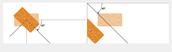
The main thing that works differently between HTML elements and SVG elements is the local coordinate system of the element. For HTML elements, this coordinate system originates at the 50% 50% point of the element. For SVG elements, the origin is, assuming we have no transform applied on the element itself or any of its ancestors inside the svg element, at the 0 0 point of the SVG canvas. This will cause different results following rotate, scale, or skew transforms if the 50% 50% point of the SVG element doesn't coincide with the 0 0 point of the SVG canvas.
In addition, transforms by SVG internal functions on SVG elements have a cumulative effect when applied on nested elements. Thus, a transform applied on an element having descendants will also affect all of its descendants along with their own systems of coordinates and the results of any transforms on those descendants.
Translate
<svg width="200" height="150" style="border: 1px solid red">
    <rect x="20" y="20" width="50" height="50" style="fill: #cc3333" />
    <rect x="20" y="20" width="50" height="50" style="fill: #3333cc" transform="translate(100,45)" />
</svg>
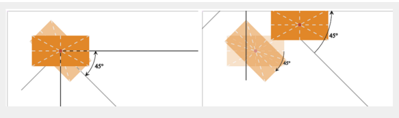
Rotate
The rotate() function rotates a shape around the point 0,0. If you want to rotate around a different point than 0,0 then pass the x and y coordinates of that point to the transform function.
Example:
Note that in svg tag we don't write units of transform (like deg, px). In the case below 1 SVG user unit is equivalent to 1px.
In this example there are 4 rectangles:
- Original rectangle.
- The rectangle is rotated 45 degrees by CSS rotate property counter-clockwise with the center of rotation at rectangle center.
- The rectangle is rotated 45 degrees by SVG rotate presentation attribute counter-clockwise with the center of rotation at rectangle center. We set here the rotation origin to (75 65) by rotate(45 75 65).
- The rectangle is rotated 45 degrees by SVG rotate presentation attribute without specifying the origin of rotation. Thus, it is rotated around (0, 0) of the canvas.
<svg width="200" height="100" style="border: 1px solid red;">
    <rect x="50" y="50" width="50" height="30" />
    <line x1="0" y1="65" x2="100%" y2="65" stroke="black" />
    <line x1="75" y1="0" x2="75" y2="100%" stroke="black" />
</svg>
<svg width="200" height="100" style="border: 1px solid red;">
    // instead of center we can write 75px 65px
    <rect x="50" y="50" width="50" height="30" style="transform: rotate(45deg); transform-origin: center" />
    <line x1="0" y1="65" x2="100%" y2="65" stroke="black" />
    <line x1="75" y1="0" x2="75" y2="100%" stroke="black" />
</svg>

<svg width="200" height="100" style="border: 1px solid red;">
    // rotate 90 degree with origin at 75, 65.
    // note that the angle is a unitless degree value.
    // omitting the origin (rotate(45)) will rotate around origin 0,0.
    <rect x="50" y="50" width="50" height="30" transform="rotate(45 75 65)" />
    <line x1="0" y1="65" x2="100%" y2="65" stroke="black" />
    <line x1="75" y1="0" x2="75" y2="100%" stroke="black" />
</svg>
<svg width="20%" height="100" style="border: 1px solid red;">
    // rotate 45 degree with origin at 0, 0.
    <rect x="50" y="50" width="50" height="30" transform="rotate(45)" />
    <line x1="0" y1="65" x2="100%" y2="65" stroke="black" />
    <line x1="75" y1="0" x2="75" y2="100%" stroke="black" />
</svg>
Note that after rotate by SVG rotate the origin of the element's system of coordinates is changed, and that origin is going to influence any subsequent transform depending on it.
If we rotate with CSS, the origin remains the same.
Try to make transform by CSS with two rotates (transform: rotate(45deg) rotate(-45deg)). This return the rectangle to its original position.
If we rotate by SVG (transform="rotate(45 76 65) rotate(-45)) the rectangle will rotate the second rotation around the axis at the new 0,0.
Scale
The scale() function scales a shape up or down in size. The scale() function scales both the shapes dimensions and its position coordinates. Thus, a rectangle positioned at 10,10 with a width of 20 and a height of 30, scaled by a factor of 2 will appear at 20,20 with a width of 40 and a height of 60.
The scale() function also scales the stroke width of a shape.
Examples: scale(2,3); scale(2);
You can use the scale() function as a mirror function by scaling by -1 along either the x-axis or y-axis. When you do, you have to first move (translate) the shape in the x or y direction, or the mirrored shape will appear outside the SVG canvas.
Example
<svg width="100" height="100" style="border: 1px solid red">
    <path d="M20,20 l20,20 l0,20 l-20,20 Z" style="stroke: #3333cc; fill:none;" />

    <path d="M20,20 l20,20 l0,20 l-20,20 Z" style="stroke: #000000; fill:none;" transform="translate(100, 0) scale(-1, 1) " />
</svg>
The above can be written also as:
<svg width="100" height="100" style="border: 1px solid red">
    <defs>
        <path id="path" d="M20,20 l20,20 l0,20 l-20,20 Z" fill="none" />
    </defs>
    <use xlink:href="#path" stroke="#3333cc" />
    <use xlink:href="#path" stroke="#000000" transform="translate(100, 0) scale(-1, 1) " />
</svg>
The blue shape is the original. The black shape is the translated, scaled shape.