CSS animation - SVGs can be animated the same way HTML elements can, using CSS keyframes and animation properties or using CSS transitions. Note that not all SVG presentation attributes can be animated via CSS. For example, we can animate 'opacity', but we can't animate the 'path' data. Only presentation attributes that are available as CSS properties can be set and animated in CSS. A list of all currently available presentation attributes as CSS properties can be found in the SVG specification here.
In addition to CSS regular animation, by using CSS on SVG we can also make:
Fill animation - when you define a fill for an element inside
<defs>, you can also animate that fill and then, when it is applied to the element, it will still animate as a fill as well. See How to Create (Animated) Text Fills for interesting animated fills.
SVG SMIL animation - SMIL can animate any SVG presentation attribute. SMIL will be deprecated in favour of the Web Animations API in the future. SMIL is not supported in IE. See "SMIL is dead!" - a guide to alternatives to SMIL features.
We can animate stroke-dashoffset of any shape to make the animation. To make it work, we first have to define stroke-dasharray for the animated element.
There are two options:
Short Dash - a shape has stroke-dasharray smaller than the shape total path length.
Long Dash - a shape has stroke-dasharray longer than the shape path length.
Short stroke-dasharray:
Example:
The following demonstrates the first option (see more in Line Animation Demo). All the three shapes in this example have identical code. The difference is the stroke-dasharray of each shape. The shape on the left has no dash and therefore it doesn't animate.
Example:
Aall the examples above are of the class 'stroke-dashoffset-anim'. The CSS animation is defined as:
We can create an animated line-drawing effect using CSS. The animation would require you to know the total length of the path you’re animating and then to use the stroke-dashoffset and stroke-dasharray SVG properties to achieve the drawing effect.
You can animate it with CSS using the following rules:
The following demonstrates long stroke-dasharray with stroke-dashoffset to zero on hover. There are two identical pathes: one is white without animation and the second is black with bigger stroke width and with offset animation on hover.
Most of the examples you see of SVG line animations use JavaScript. That's because it's hard to know what the length of that stroke actually is. Ues getTotalLength() function to get the path length inJavaScript.
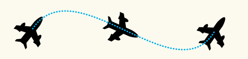
One of the most compelling things that SMIL offers for realistic motion in SVG is motion along a path. Now it becomes possible also with CSS. Chrome recently announced their initial support of the CSS Motion Path module.
CSS Motion Paths allow web pages to animate graphical objects along paths, specified using CSS. It introduces the following new CSS properties: offset-path, offset-distance (position on offset-path), and motion-rotation (auto, reverse <angle>).
Motion-rotation:
"auto" means the element will rotate with the path.
"reverse" means the element will also rotate with the path, but it will add 180 degress, so it will be facing backward.
"auto Xdeg" (or "reverse Xdeg") will do the same except add X degrees.
"Xdeg" will no longer rotate with the path, the element will stay fixed facing the same direction.
A motion path may consist of a basic shapes like circle, polygon. To allow curves and sub-paths, the specification adds the path() function in addition to the existing basic shapes functions. The path() function takes an SVG Path string as input.
Beside the CSS, SVG has another way do animation built right into the SVG syntax itself.
SMIL can animate any SVG presentation attribute. It allows complex animation. For example we can animate an object along an arbitrary path using animateMotion SVG element.
Animation is done by manipulating the attributes of shapes over time. This is done using one or more of the 5 SVG animation elements: