There are two main types of gradients:
Linear Gradients
General:
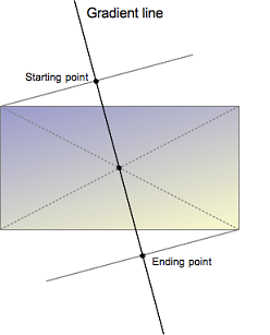
- The gradients "axis" can go from left-to-right, top-to-bottom, or at any angle you chose. Not declaring an angle will assume top-to-bottom.
- Color stops can be defined. Color stop defines the color start position.
- You can add a hard edge to any gradient just by placing two colour stops at the same location (distance). If there are the same two color stops, then a solid color instantly change to another solid color. This can be useful for declaring a full-height background that simulates columns.
Syntax:
- linear-gradient(to <direction>, <color-stop1>, <color-stop2>, ...)
- direction: [left | right] || [top | bottom]
- color-stop: <color> [<percentage> | <length>]
- linear-gradient(<angle>, <color-stop1>, <color-stop2>, ...)
- angle: an angle of direction for the gradient. The angle starts from top and rotate clockwisely. Units are deg, rad, ...
- repearting-linear-gradient(to <direction>, <color-stop1>, <color-stop2>, ...)
- repearting-linear-gradient(<angle>, <color-stop1>, <color-stop2>, ...)
Example:
.gradient {
    /* Fallback for browsers that don't support gradients */
    background: red;

    /* Standard syntax */
    background-image: linear-gradient(red, yellow);
    // Or shorthand
    background: linear-gradient(red, yellow);
}
Radial Gradients

The syntax is similar to that for linear gradients, except you can specify the gradient's ending shape (whether it should be a circle or ellipse) as well as its size. By default, the ending shape is an ellipse with the same proportions than the container's box.
Syntax:
- radial-gradient(<shape> <extent-keyword> at <position>, <color-stop1>, <color-stop2>, ...)
- shape: circle or ellipse (default is ellipse) with possible size
// Definition of the ending shape radial-gradient( circle, … ) /* Synonym of radial-gradient( circle farthest-corner, … ) */ radial-gradient( ellipse, … ) /* Synonym of radial-gradient( ellipse farthest-corner, … ) */ radial-gradient(
, … ) /* It draws a circle */ radial-gradient( circle radius, … ) /* A centered circle of the given length. It can't be a percentage */ radial-gradient( ellipse x-axis y-axis, … ) /* The two semi-major axes are given, horizontal, then vertical */ - extent-keyword: the direction of the gradient's ending shape. The default is farthest-side. The possible are closest-side, closest-corner, farthest-side, farthest-corner
- position: starting point of the gradient, which can be specified in units (px, em, or percentages) or keyword (left, bottom, etc - as background-position). If omitted, the default is center
- shape: circle or ellipse (default is ellipse) with possible size
- repeating-radial-gradient(<shape> <extent-keyword> at <position>, <color-stop1>, <color-stop2>, ...)
- The size of the gradient is determined by the final color stop.
Example:
.gradient {
    /* Fallback for browsers that don't support gradients */
    background: red;

    /* Standard syntax */
    background-image: radial-gradient(red, yellow, rgb(30, 144, 255));
    // Or shorthand
    background: radial-gradient(red, yellow, rgb(30, 144, 255));
}