 Play with filters
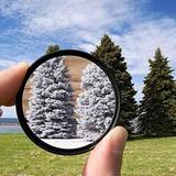
A filter effect is a graphical operation that is applied to an image or other element (efor example text) as it is drawn into the document.
CSS filters are commonly used to adjust the rendering of an image, a background, or a border.
There are ten primitive filter effects in CSS, and a filter is applied to an element by passing a filter function to the filter property. Example of usage:
.demo-block {
    background: url(images/sunset_birds.jpg);
    background-size: cover;
    filter: blur(10px); /* filter function */
}
The ten filter functions are (with parameters examples):
- filter: blur(5px);
- filter: brightness(0.4);
- filter: contrast(200%);
- filter: grayscale(50%);
- filter: hue-rotate(90deg);
- filter: invert(75%);
- filter: opacity(25%);
- filter: saturate(30%);
- filter: sepia(60%);
- filter: drop-shadow(16px 16px 20px blue); press me
We can apply multiple filters and also can use SVG filters. For example:
- filter: contrast(175%) brightness(3%); /* Apply multiple filters */
- filter: url(svg filter resource);